
This article is about the retention reports in Google Analytics 4. In Google Analytics 4 dashboard, click on Retention in the left menu bar and click overview. The first chart shows a trending view of new users to the site or app; these are the number of users who came to the site or app for the first time. The chart shows the daily trending view and the total number of new users for the time frame.
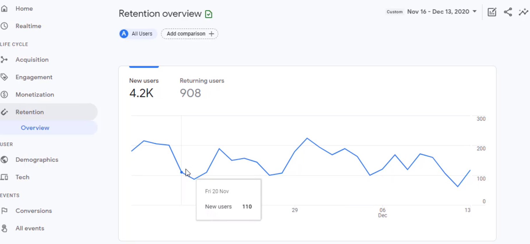
In addition to new users, it also shows the returning users. The returning users are those who had previously visited your site or app and are now returning on that day or for that period. So it is the total for the period and for each day. The more returning users a site or an app has, the higher the number of retaining users. One of the most common ways of evaluating how good a site or app is in retaining users is to look at the ratio of returning users to new users. So take returning users daily and divide it by new users for that day.
Initially, when a site or app is launched, there'll be many new users, and fewer returning users as the site matures or the advertising spend becomes stable. In that case, the new users will be low since we are not acquiring as many new users as we were, and the returning users - the ones we acquired so far- are returning to the site or app.
Hence, the number of returning users will increase, and the new users will start to become stable and grow at a smaller pace. In this case, the ratio of returning to new users will become higher. There's no right or wrong answer for what this ratio should be. Always benchmark this ratio and compare the progress against that.
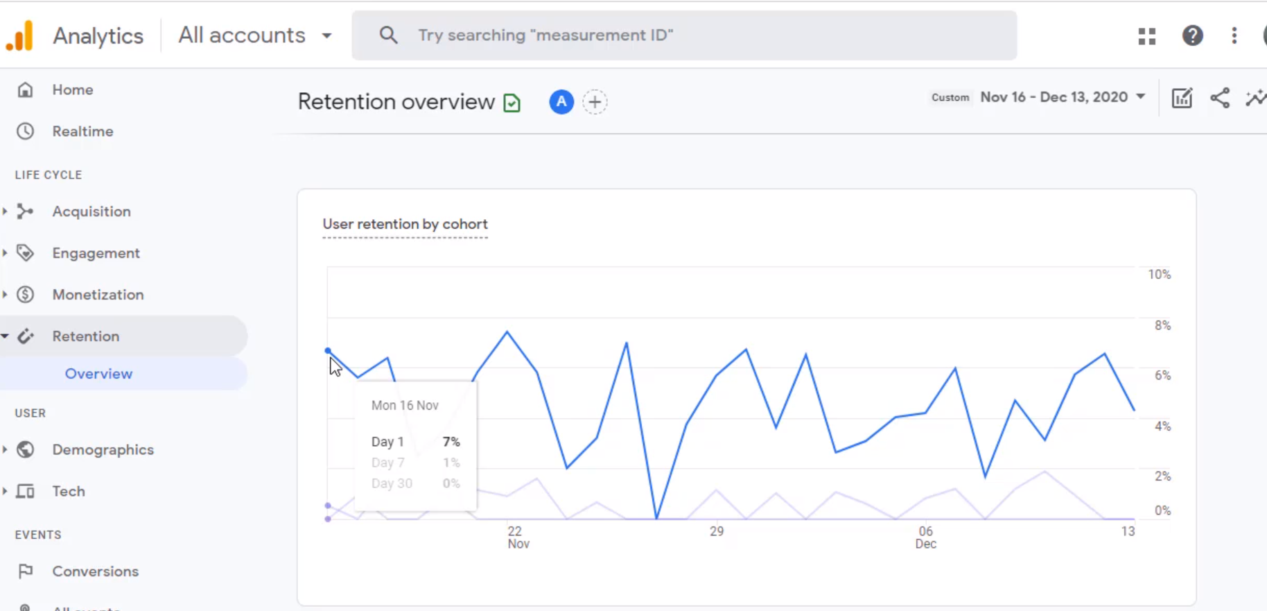
Next is the User Retention by Cohort. Cohort means the grouping of users by certain criteria. Here, it is by the day when they were acquired, so that's the user cohort. It has three line graphs. These line graphs collectively show how good the site or app is in retaining the users. The first one is a "day one" chart that shows how many users that acquired came back to the site or app after the day they were acquired. So day zero is the day of acquisition. Day one is one day after the acquisition.
The above images show that 7% of the users who were acquired on the previous day came back on this day. Similarly, it has a seven-day chart. It shows that 0% of the users acquired seven days ago returned to the site. That means this site is not doing a great job in retaining customers. There is a huge drop-off in users returning to the site and then a line graph for the day.
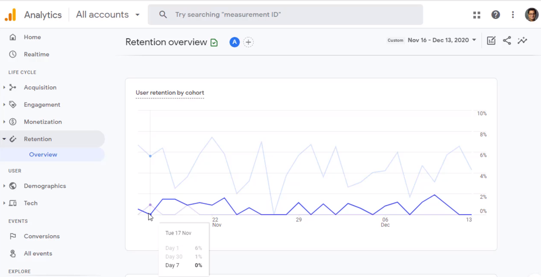
The above image shows that everybody who was acquired days ago hasn't returned to the site. This chart tells that this site has a problem retaining its users. There was a significant drop-off on day one. That means looking at this day, 93 % of the users who were acquired the previous day haven't come back to the site. Not everybody will come back to the site or app, but 93% is a significant drop; by day seven and day 30, most of the users don't revisit the site.
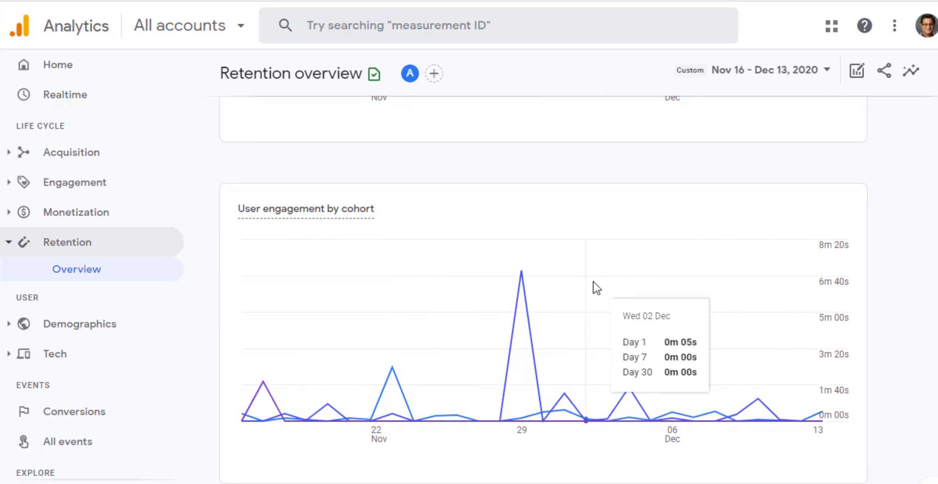
The following graph is user engagement by cohort. It provides information about how many minutes on average a user is spending after they have been acquired. So looking at this chart, we can determine if user engagement is declining over time, staying stable, or going up.
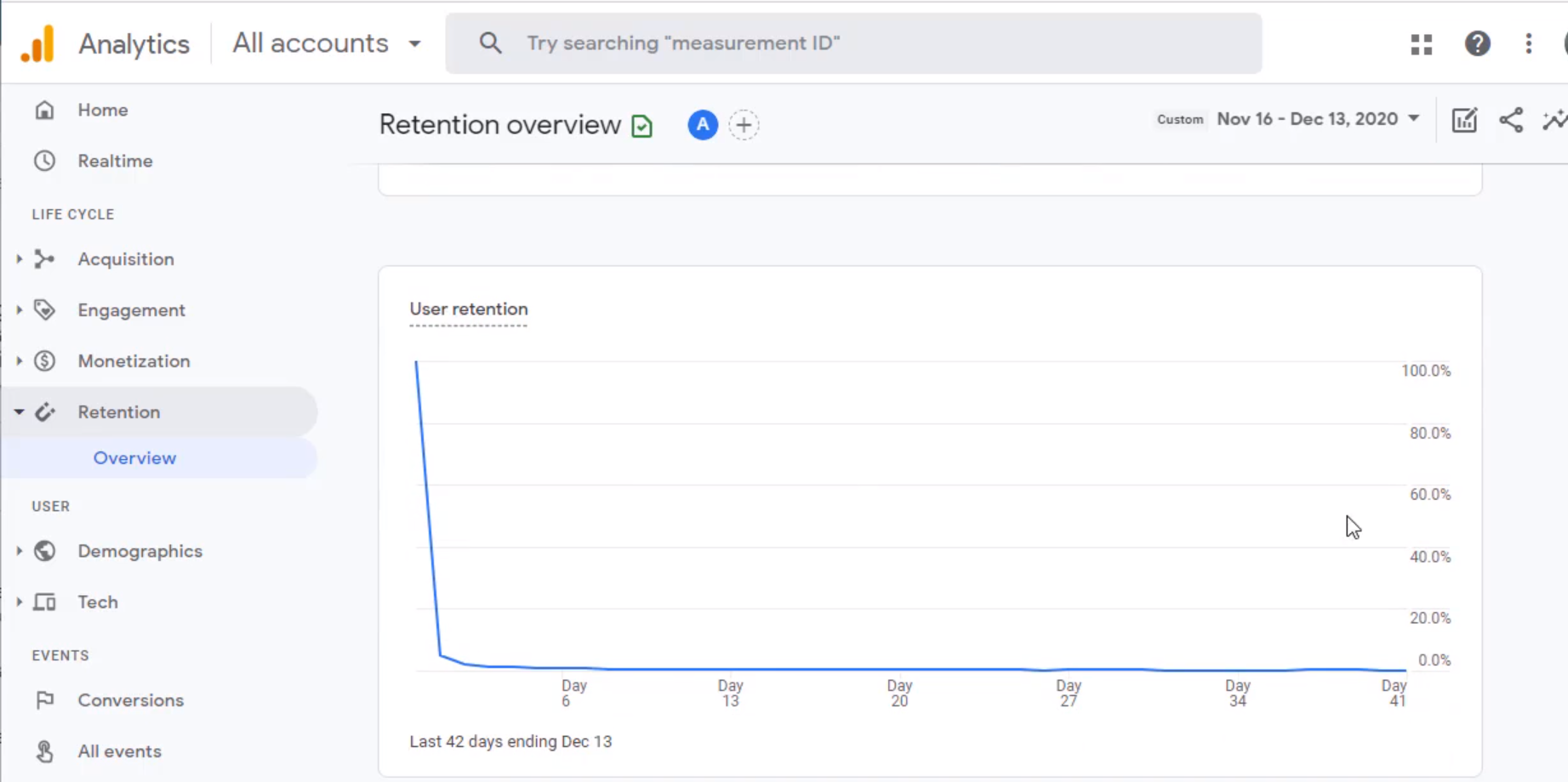
Further down, it has user retention from the day they are acquired. It is day zero because that's the first day we have acquired them. Then we can see the percent of users on average that are coming back after day one, day two, and so on. As is evident in this chart, user retention is a problem. There is a big drop-off. It is not a surprise element because user retention by cohort already shared this story. However, another chart shows the same data but in a different way.
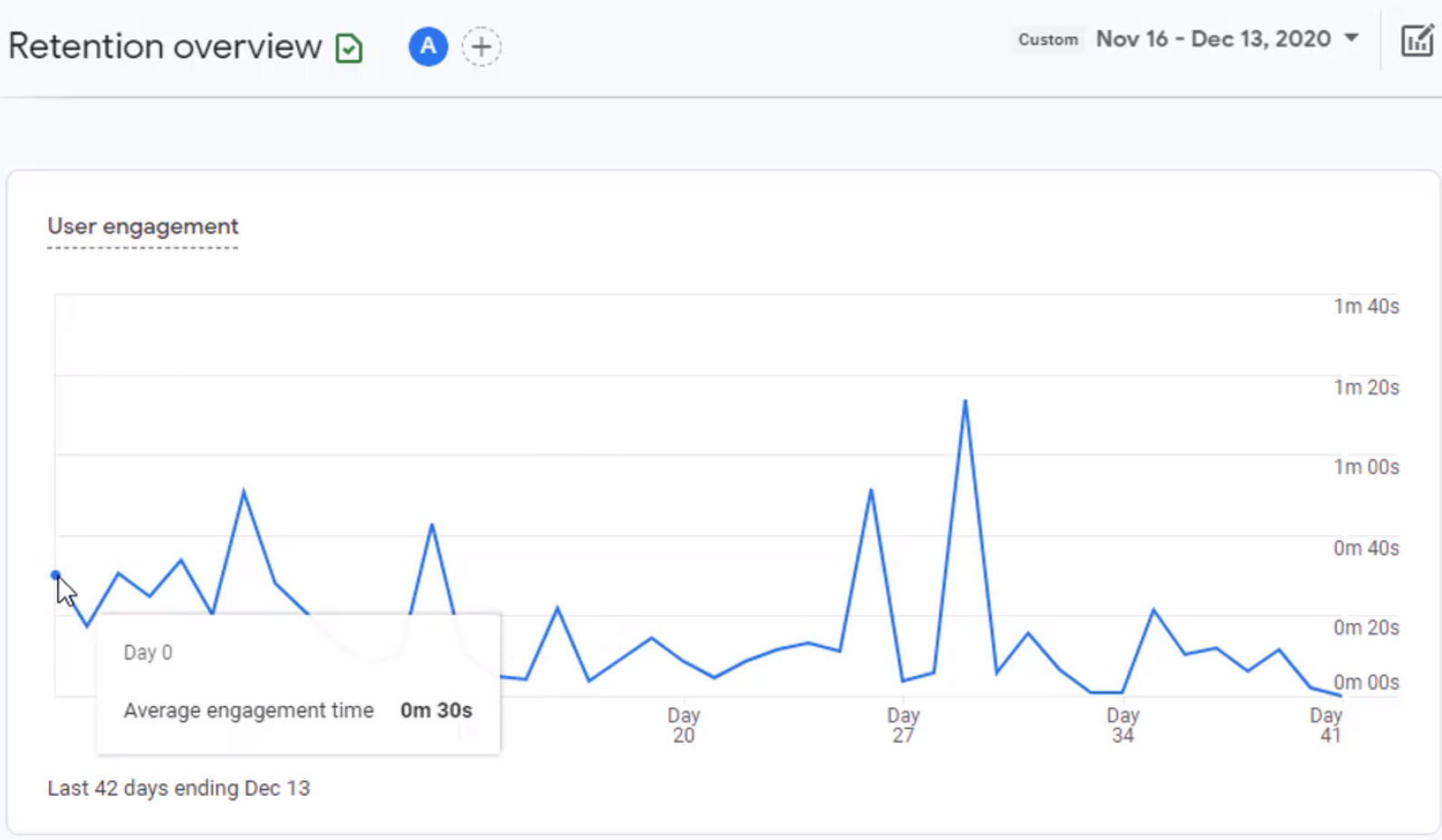
Finally, we have user engagement on each day after we acquire them. It provides information like how much time they spend on day zero, the same group of users after day one, and so on. The above chart shows that there are certain peaks. These peaks for this site correspond to the email marketing efforts. Whenever the email goes out, people receive those emails with some specific content, and they come back to the site to consume that content, and that's why we see peaks in user engagement, which tells us that email marketing is one of the ways to drive user engagement. So that's all about retention reports in Google Analytics 4.
Google Analytics 4 help and support
We are here to help you with all your Google Analytics needs. Our team can get you up and running in no time and also train you and your team to save you a lot of time so that you can focus on driving the business outcomes rather than configuring Google Analytics 4.
Online Course - If you want to learn on your own then check out Google Analytics 4 Masterclass
Workshop - We conduct the onsite customized workshop. Reach out to us for more details.
Consulting - Reach out to us for more details.